Archive for July, 2008

h1

Reclaiming the Bus

July 21, 2008

My iPod took over one day about three months ago. I can’t recall the hows or whys behind the siege, but I suddenly found myself isolated by my Bose headphones, squinting at that little 2.5-inch display, watching movies and television shows. My bus rides to and from work and school were all-consumed by this tiny device, and it was two months before I realized how ridiculous it all was. I had nothing to show for this time of transit. Instead, I was slowly ticking off my list of unwatched shows and ignoring that world around me.

Then, one day, I found a great deal on a book that I had been meaning to purchase since its release; No One Belongs Here More Than You by Miranda July. It’s a collection of short stories—the first book from the mastermind behind Me and You and Everyone We Know. As I patiently awaited its arrival in the mail, it occured to me that this was the perfect opportunity to retaliate against my iPod and reclaim my bus rides for myself.

Armed with a sunny yellow dust cover set in Helvetica Light, I boarded the bus, proud to carry the tome under my arm. I carefully chose a window seat, set my messenger bag next to me, and cracked the cover.

What followed can only be described as glorious. A new world opened up before me, and with each turned page my imagination filled with images of her characters. During one trip to work, I looked up halfway through a chapter and looked around me. My memory tells me it was a bright, sunny day, but perhaps it lies. Regardless, I saw her characters in the seats next to, behind of, and in front of me. Each face on each person in each seat was riddled with life.

That girl over there, did she just come back from Newberg after selling her body to an old fat woman? Is that the old man that did ecstasy with his elderly friend in hopes of winning a date with his teenage sister? That lady talking to the bus driver looks like she might give swim lessons on her kitchen floor.

Miranda July’s stories are bizarre, twisted forays into the lives of others. Each short story is written in the nameless first-person narrative, and each character is an exaggeration in depth and complexity. Yet the more I read, the more I can relate to what they are experiencing and dreaming. And the more I read, the more I realized that they probably weren’t that exaggerated after all. Each character has excruciating interactions with others that resonate within my soul. Their vibrant lives parallel ours by speaking what we dare never speak, thinking what we shudder to think, and exposing what we strive to keep hidden.

I think it helped that I averaged one short story per bus trip, opening and closing the book like a window into the real world of those around me. And occasionally I would pause in my reading and gaze out the window at the world, arbitrarily choosing a face for a character’s name, and imagining what stories could be told about everyone else. A smile would creep its way across my face, and suddenly the world just made a little more sense.

Then, as I closed the cover for the last time, I realized how much I missed reading on the bus. And how much I didn’t miss listening to my iPod. The battle had been waged and my iPod sulked off to the corner to lick his wounds. In fact, I have hardly listened to it since then, choosing instead to crack open another book, and then another. The joy of reading has returned, and I have turned something passive into something productive again.

h1

[S]Hit List

July 17, 2008

Re-posted from the old and defunct A Pixel, A Vector, A Blog.

by Isaac Watson

Ask me which fonts I hate, and I would start with Comic Sans. Then Papyrus, Zapfino, Chalkboard, and a few others that I see every day. Sit me down in front of my font utility and give me a few minutes, and the list would easily grow. The first ones I named make my typographic shit list because they are overused, whereas the latter faces would rank due to poor design or typographic rigidity (lack of kerning pairs, ligatures, or alternate characters). A lot of them are far too easy to loathe. Take Comic Sans, for example; there is a whole sub-culture devoted to its demise, and even a subconscious counter-culture hell-bent on propagating its use. [Incidentally, there is a future article in the works exploring our love-hate relationship with Comic Sans.]

Ask me which fonts I love, however, and I would be hard-pressed to respond. Oh, I have my favorites that come in and out like fashions, and I will certainly ooh and aah over a particularly gorgeous typeface when I see it. But I’m a firm believer that each font has its place, and I don’t believe there is such a thing as a “cure-all” font that will work everywhere. Warnock is generally good for body copy, and my blog header speaks to my new appreciation for Voluta Script.

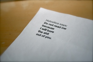
Then ask me about Helvetica, and that’s where we start to have some fun. Some time ago, my roommate returned home from work with a slightly rumpled piece of paper that she had found on the bus. “The second I saw this I thought of you and knew that you should have it,” she said. “It was just sitting on one of the seats, calling to me.” Touched by her sincere enthusiasm, I took the page from her outstretched hand and started reading. And then I cackled with delight. It was divine. There, flush left in 12-point bold it read, “Helvetica says: Do not read me because I will bore the shit out of you.” I was stunned.

“You found this on the bus? Just sitting there?”

“Yes,” she confirmed, “like it wanted to be found.”

I stared at the paper, reading the text over and over again, baffled by its simplicity, its irony, and its intent. And its design. Because at its heart, the piece had been intentionally designed. Six lines of text, the first in 30% black, the rest broken into poetry. The more I studied it, the more I loved it. The stark white space on the rest of the full sheet of paper, the ragged edge left by the typesetting, the choice to eliminate any punctuation but a colon and a period.

It was nearly too good to be true. I determined that it was either a brilliant design student intent on expressing his or her personal opinion of the typeface, or a brilliant plagiarism of someone else’s idea. Was it really left on the bus seat intentionally? Did this person really expect the one who discovered it later to appreciate it for what it was worth? Or was it all just an accident? The more I gazed at its perfection, the more questions I had regarding its origin. The line was strangely familiar, but was it really something I had heard before or just a shared sentiment resonating within?

What better way to dig deeper than crack my knuckles and open a new browser tab? A little Googling gave me enough of a lead to re-watch part of Helvetica and learn more. It turns out the phrase was not original. Stefan Sagmeister used it during his interview to describe his thoughts on a corporate brochure designed in the same way. It would seem that he was referencing a particular brochure by a firm called LCMG, though my google-fu has yet to turn up any image results of the alleged culprit. The pieces of the puzzle were starting to come together, but losing the mystery took away part of the fun. The fantasy surrounding the find was too entertaining.

Helvetica falls on neither my hit nor shit lists. It has its place in the typographic world, and has become ubiquitous for a lot of things. But sometimes it just doesn’t work. Last night I attended the Eddie Izzard show here in Portland and peered over the shoulder of a fan who was browsing the official program. There sat a spread, one side with a glamorous photo of the fabulous comedian, the other set in 14-point Helvetica Regular with 20-point leading, it’s lines spanning the width of the page. Quite honestly, it hurt my eyes; it just didn’t fit.

I love Stefan Sagmeister and his work, and I love that the posters framed behind him in the interview are all set in Helvetica (black, all caps). When it comes down to it, Helvetica does not bore the shit out of me. Not all the time, at least. Sure, I might read a paragraph or twenty of copy set in Helvetica and not think much of it, but usually my recognition of the font leads me to question the designer’s choice. What is the message conveyed? Why did they choose Helvetica? Would this have looked better in Jenson? Meta? Univers?

If anything, watching the documentary earlier this year heightened not only my awareness of Helvetica, but also of my awareness (and use) of other typefaces. I can no doubt spot those on my shit list from a mile away, and I can certainly spot Helvetica from the same distance, but what of others? I must drive my friends nuts when on the bus or walking around, because I’ll just call out any typeface I can identify. As if they were begging to be identified and validated. Yes, I see you.

Helvetica. Helvetica. Papyrus. Comic Sans. Helvetica. Lucida Handwriting. Helvetica. Bank Gothic. Futura. Helvetica. Helvetica. Zapfino. Helvetica. Helvetica. Helvetica.

So thank you, Helvetica, for not boring the shit out of me enough to ignore you. Thank you for your prevalence. Thank you for your ubiquity. Thank you for your complacency, your simplicity, and your stability. Thank you for reminding me that there are other typefaces in the world, and thank you for helping me appreciate typography even more.